Microsoft: Jobs to be Done
-
Role
UI design, Visual design
-
Team
Soodeh Montazeri, Senior UX researcher
Sara Hefny, UX researcher
Paula Bach, UX research manager -
Tools
Adobe Illustrator, Figma, Print
-
Deliverables
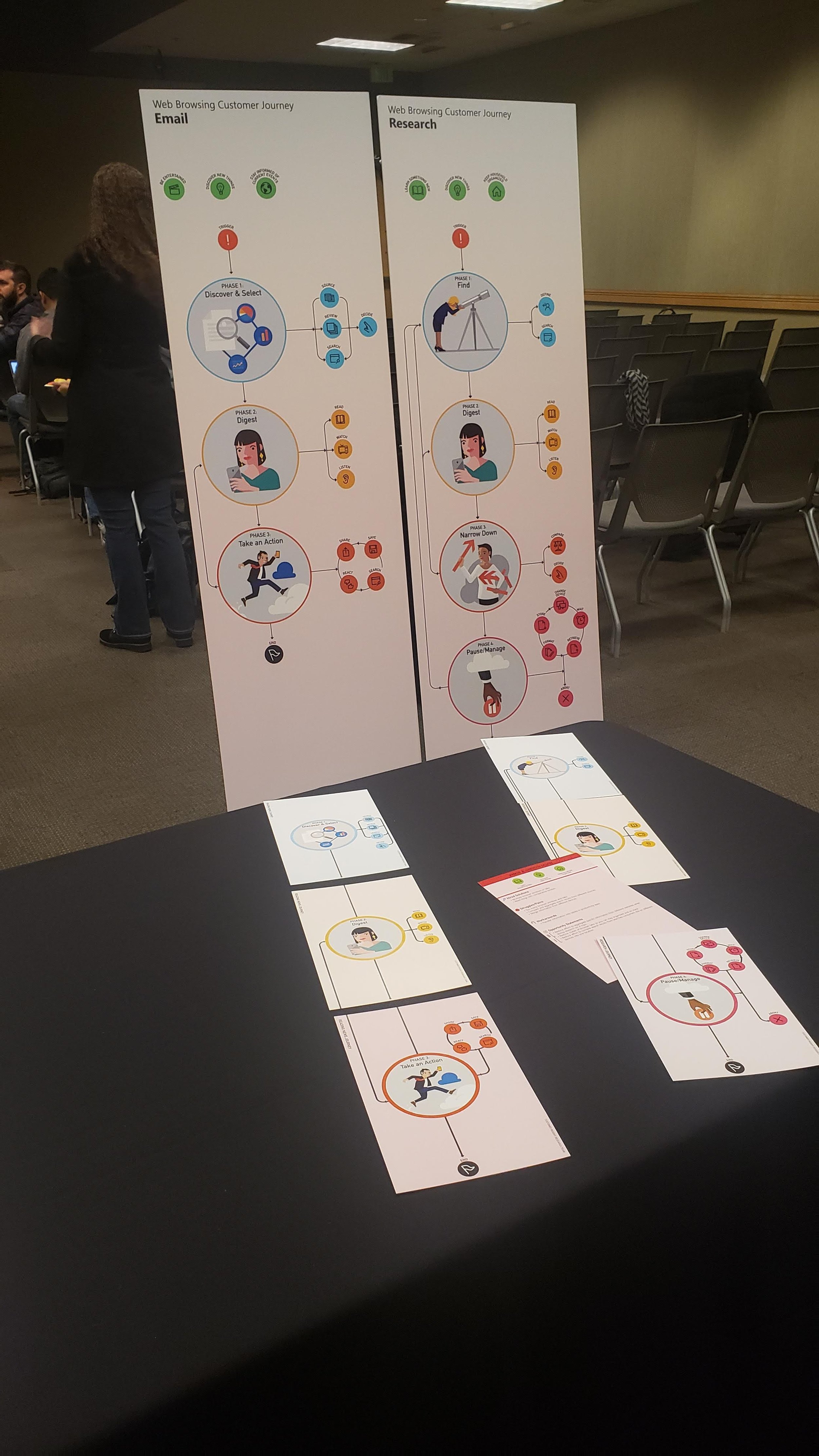
Large-format posters
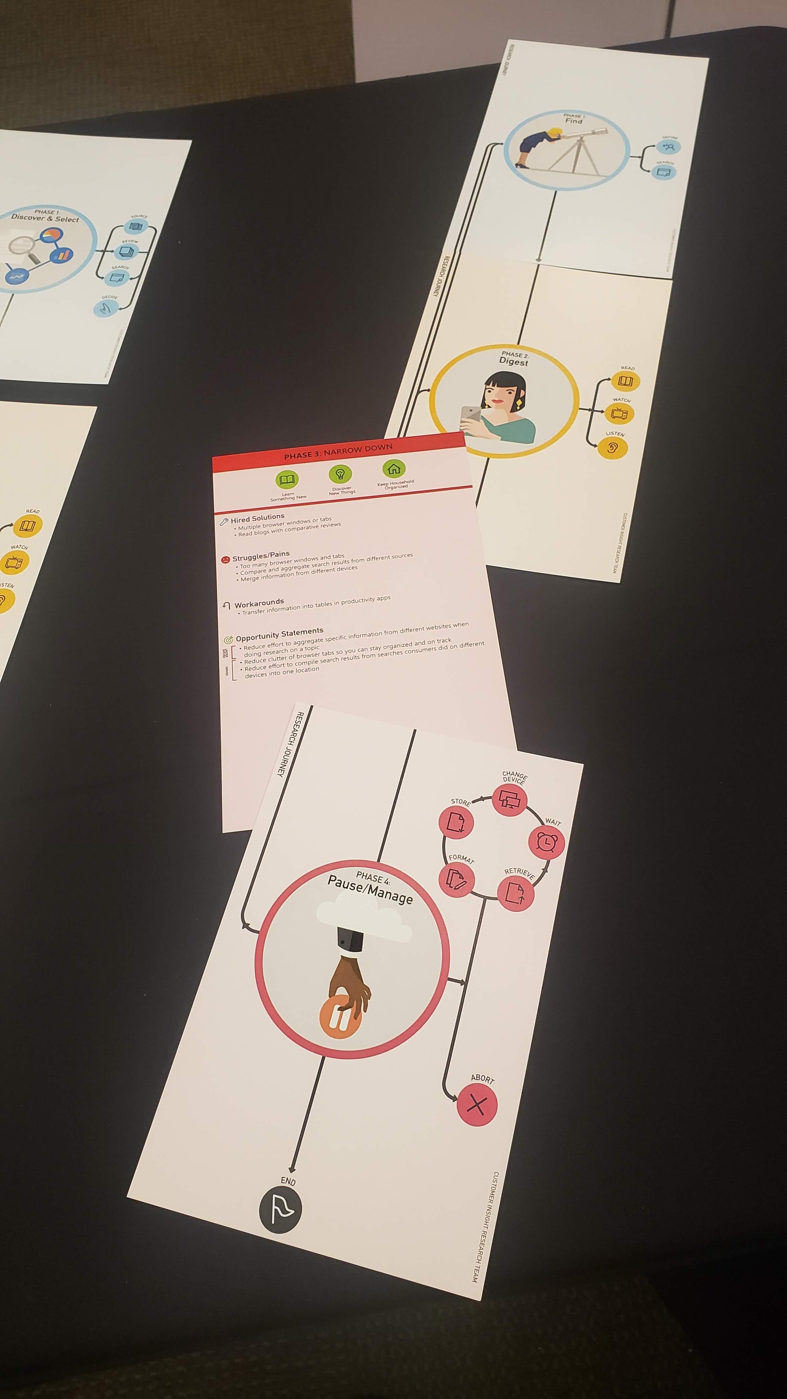
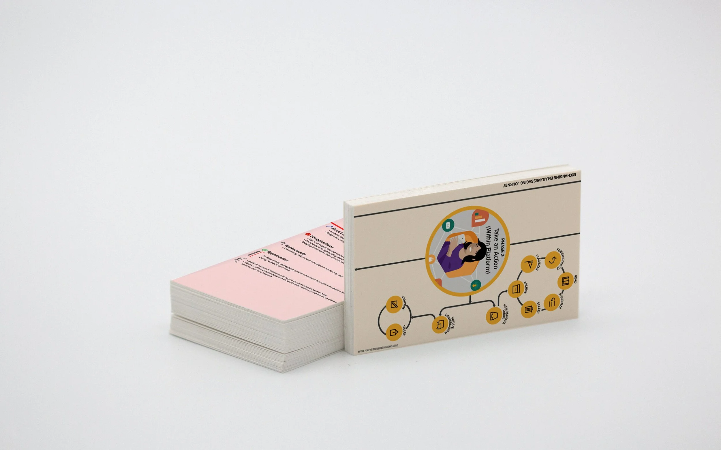
Journey map cards
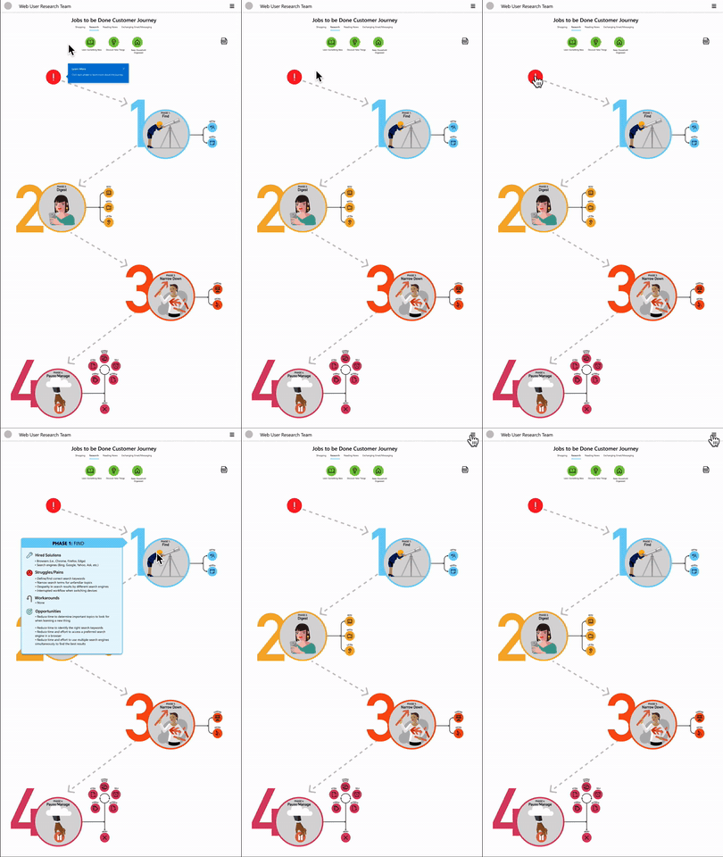
Digital journey dashboard (prototype)
Internet Browsing Jobs to Be Done:
Global Opportunities for Innovation
This is a collection of research based on data gathered around global Jobs To Be Done for browsing the internet. Jobs to Be Done (JTBD) is a framework based on the idea that whenever users “hire” (i.e., use) a product, they do it for a specific “job” (i.e.,to make progress on a particular thing, to achieve a particular outcome). The list of “jobs” should be seen as a set of user needs that are satisfied by "hiring" a product.
With the launch of Chromium-based Microsoft Edge, Anaheim, a multi-step effort has been initiated utilizing previously identified browser Jobs to Be Done to: validate the jobs/activities people hire a browser to do and identify job/activities with highest opportunities for innovation, understand the journeys and steps people take to accomplish these jobs, discover under-served needs when completing jobs and activities using any web browser and other solutions, and identify and prioritize opportunities for the Edge browser to demonstrate both innovation and differentiation upon and after relaunch.
The main activities explored during this period of data collection were: research, shopping, reading the news, and sending emails and messages.
Making Sense of the Data
In collaboration with researchers, I delved into a global exploration of internet usage, reviewing hours of interviews from diverse perspectives. Collaborating closely with the senior researcher, we identified users' internet-driven challenges and delights.
This process facilitated the creation of linear customer journeys, mapping out the distinct pathways for each identified problem.
The Journeys
The senior UX researcher and I conducted a user research to test out the information given on two designs.
What worked? What was confusing? What did they like?
“Line” Journey
Shows the customer journey steps and which steps get repeated
No details in the journey
What did each step mean?
“Detailed” Journey
The direction of the information is confusing (horizontal and vertical)
The phases and steps don’t interact with one another
Information overload
Best of Both Worlds
The feedback from the user testings allowed me to pinpoint what worked and what didn’t in each version.
The “Line” Journey were fleshed out to include illustrations and icons to better showcase the phase. The information in the “Detailed” Journey was scaled down to be consistent with each phase.
With these changes, I created the Customer Journey Cards. These were physical cards that displayed the illustrated phases on one side and the in-depth research on the back.
These were presented at the 2020 Microsoft UX Day.


Dashboard
Due to the 2020 COVID-19 pandemic, we were unable to distribute the physical cards showcasing the journey information.
I created dashboard on figma that could house the journeys and information, as well as other journeys and research the Web User Research Team has conducted.


